Opera House posters: Hidden gems
For the first time, the Opera House opens its performance posters archives, revealing some forgotten moments.
While waiting for a train or driving past a bus shelter, do you look up and appreciate the designs that gleam through billboards, enticing you to see the latest Sydney Opera House performances on offer?
If a picture is worth a thousand words, what does an event poster tell us?
The Sydney Opera House has a lasting legacy of working with Australian artists to colourfully express the variety of performances under the sails.
The role of the poster is still as relevant now as it was 50 years ago. Its purpose is to create interest and communicate a message to audiences.
As posters age they become collectible items that represent a moment in time, appreciated more for their form and nostalgia over their function.
While our venues are closed, our design team have been digging through the archives to select some of their favourite interpretations of the iconic sails. From abstract to literal, let’s go on a trip through poster history.
Louis Vuitton Sydney Opera House Balloon (1988)
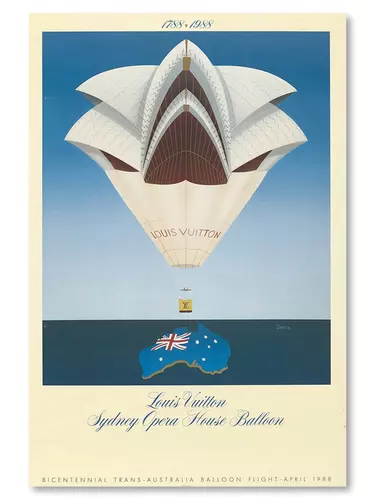
Designed by Gérard Courbouleix–Dénériaz, reviewed by Ali Boschen
At first glance, it’s tricky to glean what this poster is communicating. The takeaways are: Sydney Opera House, a hot air balloon and Australia. Along with the calligraphic title and an original painting, the designer has given this prestigious event – a hot air balloon race from Perth to Sydney to celebrate the Australian Bicentennial – the luxury feel it deserves.
Designed by Gérard Courbouleix–Dénériaz, more commonly known as Razzia, this poster is reminiscent of 1930s Art Deco travel posters with its aged palette and border. The obscure depiction of the Opera House is made symmetrical to fit with the shape of the balloon.
Although not a familiar view of the House, the iconic sails and key reference to the architectural structure make it recognisable.
Typically Razzia’s posters playfully combine components of the event, the Auckland Louis Vuitton Cup in 2003 being another seamless example of this.
Although arguably not the most natural combination of the Sydney Opera House and a hot air balloon, the collage-style conjunction of the two feels oddly charming and surreal. A delightfully dreamlike poster for a celebratory event that looks to be returning next year.
The Bicentennial Balloon Race saw over 78 hot air balloons race from Perth to Sydney in celebration of Australia’s 200 years since European settlers made camp. With teams including the Australian Army, Toyota, Kodak Film and of course the Sydney Opera House, 17 countries participated in the challenge.
The Sydney Opera House is Ten (1983)
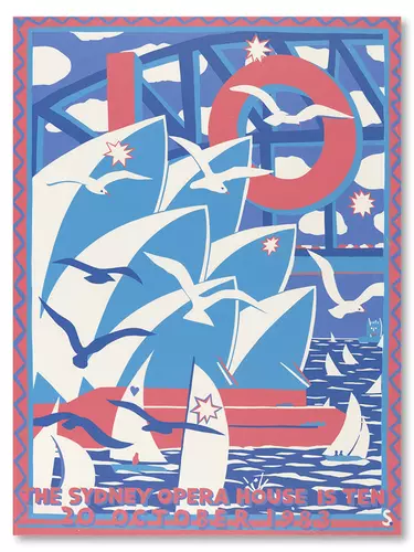
Designed by Martin Sharp, reviewed by Louise Elliott
Bold, bright, vibrant and colourful, this poster grabs your attention and celebrates all that we love about Sydney; the beautiful glistening harbour, the largest steel arch bridge in the world, the seagulls soaring through the sky, the sailing boats catching the sea breeze, and in the middle of it all a masterpiece of human creativity – the Sydney Opera House.
This poster was designed and screen-printed by renowned Sydney-based Australian artist Martin Sharp in 1983 to mark the Opera House’s 10th anniversary, following a long and controversial period of construction.
I love the way Sharp has captured all these symbols of Australian identity into one poster that could become quite overwhelming. Stripping back to a triadic colour scheme brings balance, harmony and depth.
3 Choral Masterpieces (1978)
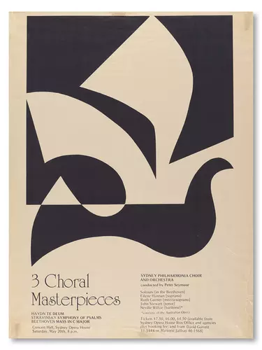
Designer unknown, Sydney Philharmonia Choir, reviewed by Dan Ingham
At what point does a drawing of a dove no longer resemble a dove? At what point does the architecture of the Opera House become unrecognisable? These are questions that spring to mind when looking at this poster.
Abstraction is a technique often described as simplifying or removing the unnecessary elements to present a more powerful image. At initial glance the poster presents a peaceful dove with its wings caught in flight.
Where this poster gets interesting is through the addition of the black box, which cuts through the tail and reframes the wings to become an abstract version of the famed sails.
Abstraction can always be a balancing act, but through bold black and white shapes this poster creates an intriguing visual that demands a deeper look.
Founded a century ago, Sydney Philharmonia Choirs is the largest choral organisation in Australia and as one of our resident companies it calls Sydney Opera House home. We recently hosted the first-ever virtual PopUp Sing! workshop, presented by Sydney Philharmonia Choirs, in our Digital Season.
Utzon Music Series (2012)
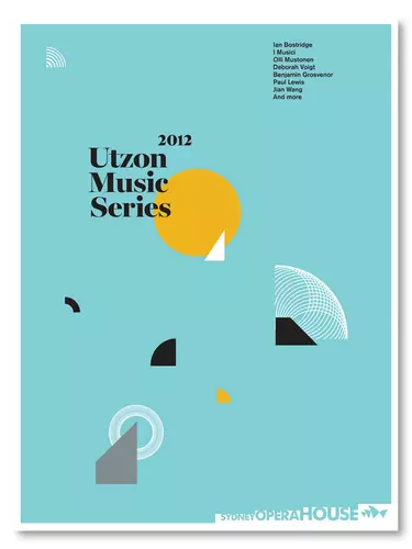
Designed by Garbett Studio, reviewed by Sylvia Zheng
In 2012, Sydney based agency Garbett designed this playful poster for the Utzon Music Series. The studio’s trademark style of bright colours and geometric shapes are clear here.
The image's interpretation may be different for each viewer, but for me, I see sun and sea – a yellow egg yolk sun and blue skies atop the sails on the harbour. Although not a realistic depiction, the use of quadrants and the detailed white arc shape lead us to think of the House's familiar shapes.
Sometimes all we need is a few hints to the bigger picture and our minds will connect the dots.
For the past 13 years, the Utzon Music Series has seen an eclectic ensemble of musicians perform in the Utzon Room. The intimate space provides a unique opportunity for the audience to feel connected to the artists performing merely metres away.
Vivid LIVE (2016)
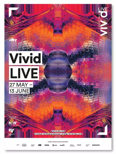
Designed by Leif Podhajsky, reviewed by Sylvia Zheng
The Australian-born graphic designer Leif Podhajsky has been a long time contributor to Vivid LIVE.
This wonderful abstraction of colour and pattern is the visual of Vivid LIVE 2016. The festival itself is the intersection of progressive trends in music, culture and technology – and Leif's psychedelic landscapes are the perfect match.
He uses the technique of ‘displacement mapping’ on Photoshop, which allows him to digitally collage images together. It’s not immediately recognisable but upon inspection, we see the chevron pattern of the sails chopped and reflected across the poster.
The bright oranges, reds and purples all bleed into one another, bringing a kaleidoscopic burst of colour and liveliness to the festival identity.
Since 2009, Vivid LIVE (first launched by Brian Eno as Luminous) has been a cornerstone event on the Sydney Opera House bill. Featuring local and international acts, Vivid LIVE represents the fusion of art, music and culture across Sydney.
